
Start off the new year by treating yourself to the crafting fun of our January Virtual Album Retreat!

Start off the new year by treating yourself to the crafting fun of our January Virtual Album Retreat!
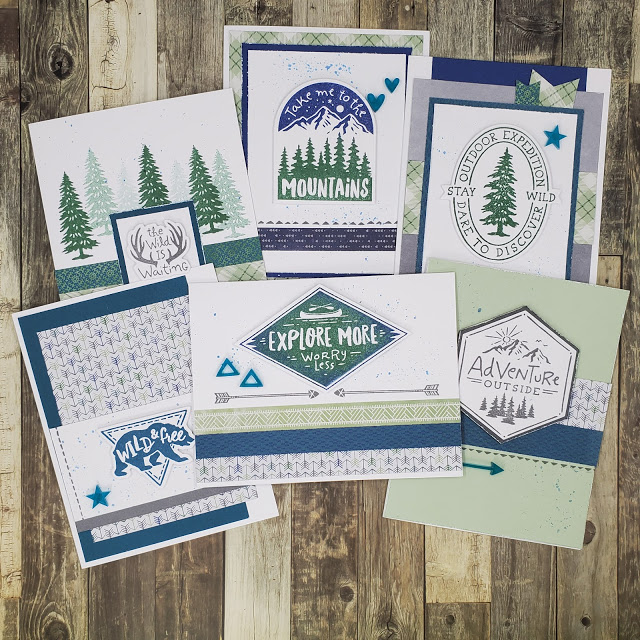
If you’ve been following my blog this month, you’ve seen several projects using products from the Aurora collection. Today, I’d like to share with your some outdoor themed cards I made recently using these products.

You may have noticed that these cards do not really have greetings but instead a phrase that reflects an outdoor mentality. That leaves the occasion for the card up to you! You could easily add a “happy birthday”, “happy Father’s Day” or other sentiment to reflect any occasion. Or just add your personal note on the inside to let an outdoor lover know that you are thinking of them.
All of the stamping on these projects is from the Aurora – Scrapbooking Stamp Setand Thin Cut Set. Although these stamps can be used to make beautiful die-cut embellishments for your pages, as you can see they are versatile enough to work on cards too.

Here’s a closer look at these cards along with a few notes about the techniques used.

Each of these cards has a single die-cut piece stamped with a coordinating image. Because our stamps and blocks are clear acrylic, you can see through them to place the image. To get the best transfer of ink, place the foam that is included with every stamp set under the paper before you stamp.

The splatters on the tag were added using Sapphire ink. To get this look, squeeze your ink pad so that some ink remains on the inside lid. Then use a wet brush to pick up the ink. Tap the brush on your finger above the paper where you want the drops to be.

In addition to splatters using the technique from the first card, I distressed the edges of several of the papers with my scissors. Doing this with closed scissors keeps tearing to a minimum.

The trees in the mist on this card were created with second and third generation stamping. To get this look, ink the stamp up with Evergreen ink. After stamping, stamp again to create a lighter tree (2nd generation) and a thrid time for an even lighter tree (3rd generation) before inking the stamp up again.

The sky and trees on this card were stamped with a single stamp. You could cut the stamp — seriously, I cut my stamps all the time — to stamp them separately. However, I wanted to make sure it lined up correctly, so I just inked the sky off the edge of the Sapphire ink pad and the trees off the edge of the Evergreen ink pad. Then I was able to stamp both colors at one time.

This final card uses the Rock & Roll stamping technique. To achieve this look, ink the stamp with Evergreen ink. Then gently roll the edges of the stamp on the Sapphire ink pad before stamping on the die-cut.
Products used on these cards:
Aurora Paper Packet (X7256B)
Aurora – Scrapbooking Stamp + Thin Cuts (Z3711)
Aurora Acrylic Shapes (X7256E)
Cardstock (Peacock, Sapphire, Sage, Charcoal & White Daisy)
Ink Pads (Charcoal, Sapphire, Evergreen & Peacock)
See all of the Aurora products>>
I hope these cards encourage you to try new distressing or stamping techniques.
Keep Creating,
Rebecca
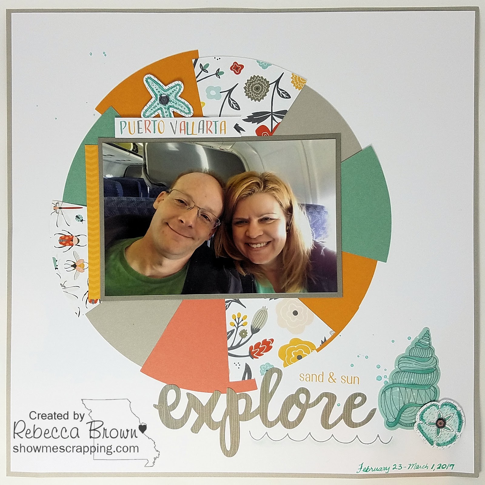
About a year and a half ago, Eric and I had the privilege of traveling to Puerto Vallarta with Close To My Heart. This was my first incentive trip and I was surprised to learn that in addition to an amazing trip, we each received materials to make 22 scrapbook pages! Our kits included pre-cut papers, stickers, stamp sets, thin cuts and embellishments.

We also received complete assembly directions. As you can see from the samples in this post, these were not simple layouts. They incorporated lots of fun techniques that I usually don’t take the time to do. Today, I’m going to show you several ways we used watercolors.

First we used watercolors to add some paint drops on the base page. This technique is so easy. You simply wet your brush, swish it around in your paint then tap it on your fingers to create some splatters.

We also used watercolors to paint the shells. You may notice that they were cut from patterned paper, so there was already some color on them. By varying the paint to water ratio, we were able to create darker color in some places. You may also notice faint watercolor below the scallop stamp to give the illusion of water.

This second layout also has splatters of watercolor. This time in black so the effect isn’t quite as subtle.

This layout also has a little watercolor under the scallop “wave” stamp.


The watercolor on this one was the hardest for me because I like things that are neat and this was certainly a mess. We were supposed to just roughly paint a few areas of the base page. I was sure I had ruined it but I love how it turned out.

Journaling on this page says, “I feel so blessed to go on this trip. Thank you Close To My Heart for making it possible and for all the extras that made it special. Eric and I had an amazing time. Can’t wait for the next one!”
Thinking back on this trip makes me feel so grateful. Not just for the trip (although it was pretty amazing), but also for the friends got to spend time with. And for all the extra perks including these beautiful scrapbook pages.
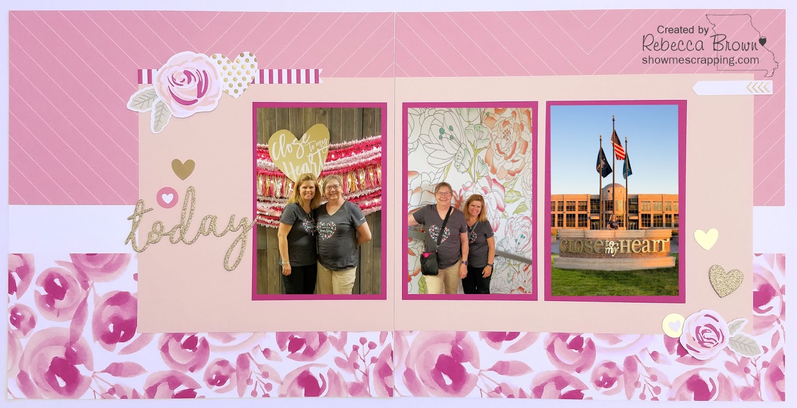
One of the highlights of the Close To My Heart convention in Salt Lake City was a tour of the Home Office. This is another one of the layouts we made at convention and it was so pretty, I reserved it for my most special photos from the tour.

In the first picture, my friend Faye and I are posing in front of a nice photo opp they had set up soon after we came into the building. The second is on the steps leading from the main entrance to the upper floors where we got to see Jeanette’s office and the art studio. The final picture is in front of the picture —– this is the “Mecca picture” for Close To My Heart consultants. It really felt like going home seeing this building that so much creative goodness flows out of. Such a memorable experience.
Because I have so many pictures of the tour, I plan to add a few Protector Pluspages between the pages of this layout. Or perhaps, I’ll use Flip Flaps to layer more photos directly on the layout. I’ll figure that out once I print the remaining pictures.

Although the floral accent pieces look like they were made to match the paper, they are actually stamped using the new Beautiful You (D1741) stamp set. They are perfectly trimmed because of the coordinating thin cut set. The flowers on this stamp set are triple layered creating a lot of depth in your images.

Getting the layers lined up can be a little tricky. Once you pull the stamps off of the carrier sheet, you lose the orientation and it can be difficult to line the layers up properly. A little trick I learned from another consultant was to use a sharpie and mark the top side of each stamp BEFORE removing it from the sheet. Then when you are stamping you know which side is up and if you are consistent you will have good results.

Here’s a card using that same beautiful stamp set.

Hope you have enjoyed these projects and feel inspired to create some of your own!
Always create,
Rebecca
Want to take your paper projects up a notch? Distressing is the best way to make your project come together and look professionally made. Almost every project I do uses one of the forms of distressing shown in this video. It doesn’t look complete until something has been torn, inked, sanded or scratched. Some how roughing things up a bit makes all the pieces come together into a cohesive look.
What is your favorite method of distressing? Share your thought in the comments below.
Happy Creating,
Rebecca
You’ve probably seen the Ombré look in magazines, on TV and at the market — it’s everywhere! If you’ve heard of this trend, most likely you are picturing hair that gradually lightens (or darkens) from the roots to ends. The latest wave of this trend also includes gradually changes in color.
This style trend has extended well beyond the doors of a salon and can now be seen in clothing, nail color and even food.
 |
| Ombré Cake by The Hungry Housewife |
You can also use the Ombré technique in your crafting. Here’s a video showing you one way to add this current trend to your paper projects.
Another great video from My Craft Channel’s series Clearly the Best. In this one, Monica & Kristine give tips for stamping on multiple surfaces with several fun project ideas.
The second episode of Clearly the Best, Stamping with Close To My Heart is now available for viewing. Watch this video to see how easily you can create movement to your stamped images by swiping!
GIVEAWAY DETAILS:
Close to myHeart is sponsoring a giveaway on My Craft Channel. The prize is the fun “Trinity
Alphabet” Stamp Set and there will be THREE lucky winners!! Here’s all you have to
do to enter to win…
Read the post for how you can enter additional times using Facebook, Twitter and the CTMH website.
Close
To My Heart is excited to be working with My Craft Channel , an online craft TV
network, to create a new video series called Clearly
the Best. If seeing is believing, then viewers will quickly see
that when it comes to stamping, Close To My Heart’s My Acrylix® stamps and
blocks are truly the best.
This first episode was released yesterday. “Bend It, curve It, stamp It” features a stamping
technique to manipulate the stamp images for personalized designs.
You can sign up for free at http://www.mycraftchannel.com to receive email notifications every time a new video in the Clearly the Best video
series is released. That way, you’ll be sure to catch every episode! Sign up
today.
Get Set! Go!
Over a week ago, the postman brought these to my door:

Yippee Skippee! Yes, I have FINALLY have an assortment of the new alcohol markers! The last couple of days, I have finally had a chance to play with them a little.
Who says coloring is for kids? Here are a few of the things Emily & I have colored over the last few days.

Soon I’m planning to share with you some finished artwork as well as some tips learned in the process.
Until then, you can watch this video to learn about the smooth effect you can create with the new alcohol-based markers. Use the two complimentary colors to create one amazing piece of artwork!