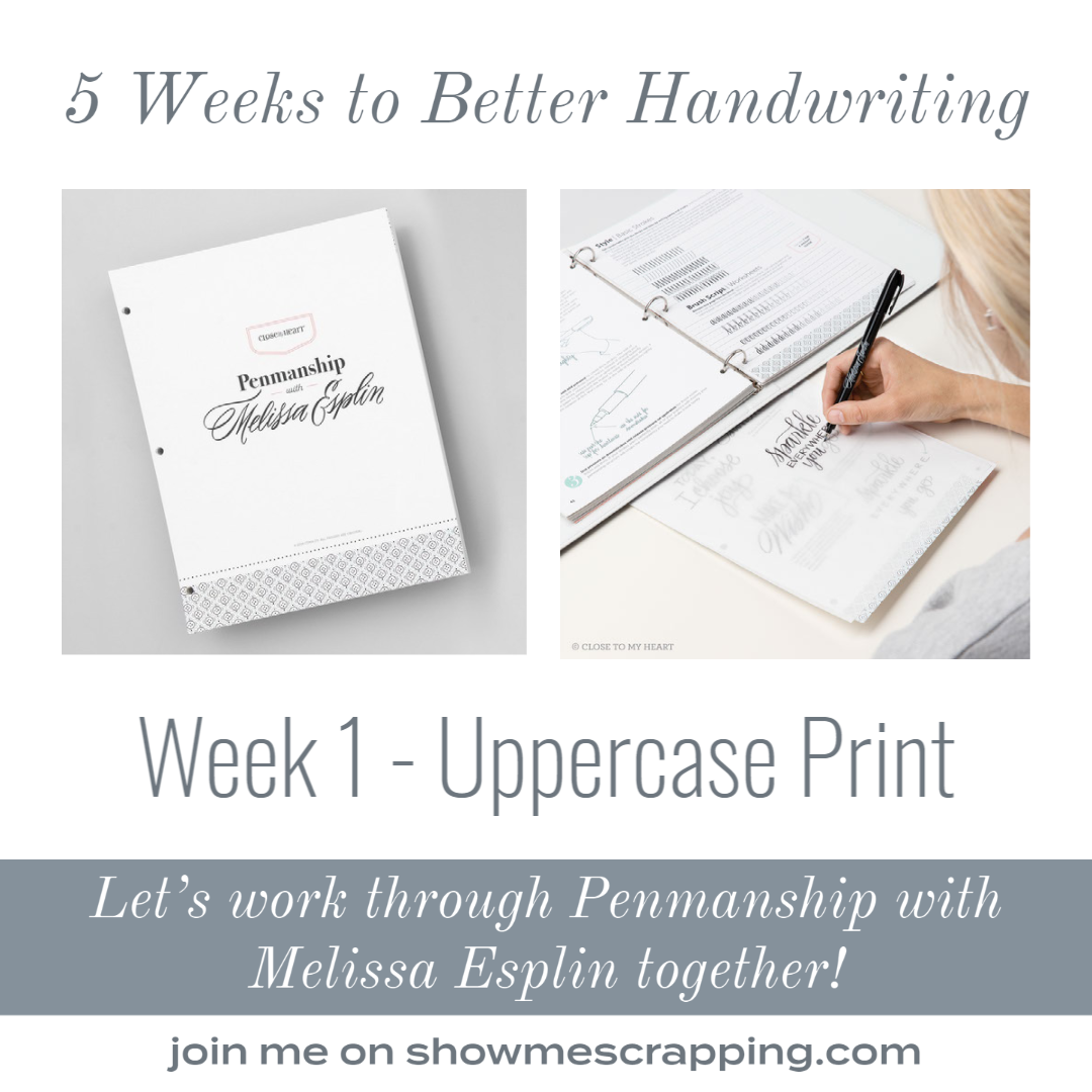
Last week, I kicked off a series of posts focused on improving handwriting. I’m working my way through the Penmanship with Melissa Esplin book and invite you to join me! . This week, I tackled chapter 1 and in this post, I’ll show you some of my practice work and share a few tips I learned.

Review other posts in this series:
- Introduction
- Chapter 1: Uppercase Print (this post)
- Chapter 2: Lowercase Print – coming February 1
- Chapter 3: Lowercase Cursive – coming February 8
- Chapter 4: Uppercase Cursive – coming February 15
- Chapter 5: Developing Style – coming February 22
Getting Started
Before diving into chapter 1, I read through the helpful information in the Getting Started section of the book. This includes a vocabulary list which will help you get familiar with some words related to handwriting. I had a general idea of what some of them meant like Negative Space and Stroke and could make an educated guess on others. But it was interesting to know that there is a name for specific parts and characteristics of letters. Do you know what the Ascender of a letter is? I didn’t, but now I do 🙂
This section of the book also had some tips for getting started. These included tips for choosing a writing instrument and how to hold it. She also stressed taking your time and planning. Two things that are very hard for me and these were great reminders for me to now rush.
Chapter 1: Uppercase Print
In this chapter, Melissa walks through some basic strokes then groupings of similar capital letters. For each group, there are notes about how to approach this set of letters and a diagram of each one showing the stroke order.

Once all of the capital letters have been introduced, there are worksheet pages with a 4mm line for each letter, plus the numbers and a few basic punctuation marks. Each line starts with a solid sample of the letter, then as you move to the right it fades out.

I pulled these pages out of the binder so that I didn’t have to work around the rings, covered it with tracing paper and practiced each one. At the beginning of the line, I was simply tracing over the letters from the worksheet, but eventually I had to form the letter myself. I learned that I did better that even on those initial letters, I focused more on the top and bottom line and what I was writing than the printed letters. That made the transition as I moved to the right easier.

After finishing the exercises from this chapter, I pulled out the 5mm grid paper from page 5e in the book and practices writing a few random words and phrases from 1 to 3 squares high.

Although these are in no way perfect, when I compare them to my “before” letters from last week, I’ve definitely made progress. Over the next week, I’m going to practice my uppercase letters more and work through Chapter 2: Lowercase Print. Come back next Monday to follow along.
Lessons Learned
In addition to learning a standard way to form each letter and that I need practice to improve my uppercase letters, I learned several things that will help me next time I need to add some journaling to a scrapbooking layout. Here are three things that I learned:
- I hold my pen too tightly which causes my letters to be too heavy. It also makes it harder for me to do the movements so they are not as flowing as when I focus on a lighter grip.
- Rushing not only makes my writing sloppy, but it also makes me skip over the planning part. Writing out what I plan to write ahead of time will help me make sure I choose the right words and figure out line breaks before putting the pen on my project.
- Having a standard way to write each letter is important. I’m sure my elementary teachers taught me the “right” way to make each letter, but that learning has been lost over the years and I tend to scratch them out helter-skelter. An “A” that I write today may look a lot different that what I write tomorrow. By focusing on writing each letter the way Melissa instructed made my writing much more even and neat. It is going to take practice for this to feel natural!
- To help make even letters it helps to have a guide line. You can use lined paper, grid or draw the lines with pencil and erase after your ink is dry. Another tip from the book is to use a piece of washi tape. After writing, just pull it up!

Although I’m planning to continue to post my progress and a few tips I learn along the way, if you’d like to work on your handwriting with me, I’d encourage you to get a copy of Penmanship with Melissa Esplin. There is so much information in this book that I can’t cover in this blog series.
Keep Creating,
Rebecca
